Tomorrow's issue of The Phoenix has Simon Swift's latest nemesis 'The Fetch' taking centre stage on the cover- here are all the stages on the way to the finished piece. This isn't a particularly in-depth analysis about my process, just an overview of my approach.
Thumbnails
The idea that Tom, Will and I had talked about was having The Fetch on the cover frosting up the jungle, with that in mind I sketched out 3 very loose thumbnails in Photoshop. They liked the third of these the most, but Will suggested that it would look stronger if The Fetch was facing the reader more.


Rough Cover
I then took the basic idea from the third thumbnail and roughed it out very loosely in Photoshop.

Pencils
Once the rough was approved I made the rough very light by reducing the opacity of the line layer in Photoshop. I then printed the very light rough out onto a sheet of A3 Bristol Board and used it as my loose guide upon which to draw tighter pencils. I kept a lot of the foliage relatively loose at this stage as it needed to be drawn over in ink anyway. I pencil using a blue col-erase pencil. Blue is best as it's easier to remove the pencil art digitally if it isn't black, that way it's a lot less hassle to end up with crisp ink lines on the finished piece.

Inks
Once I was happy with the pencils I started inking. I currently use 'Fountain Pentel' pens as I like the line they produce. I use a fine sharpie for the thicker lines and solid blacks.
Colours
I then use Photoshop to remove the blue lines that show through the inks and separate the lineart onto its own layer, so it 'floats' above the white layer. I build up the colour in layers, beginning with flat base colours and adding layers for shading, lighting, steam effects and the eye glows as I go until I'm happy with the result.

Final
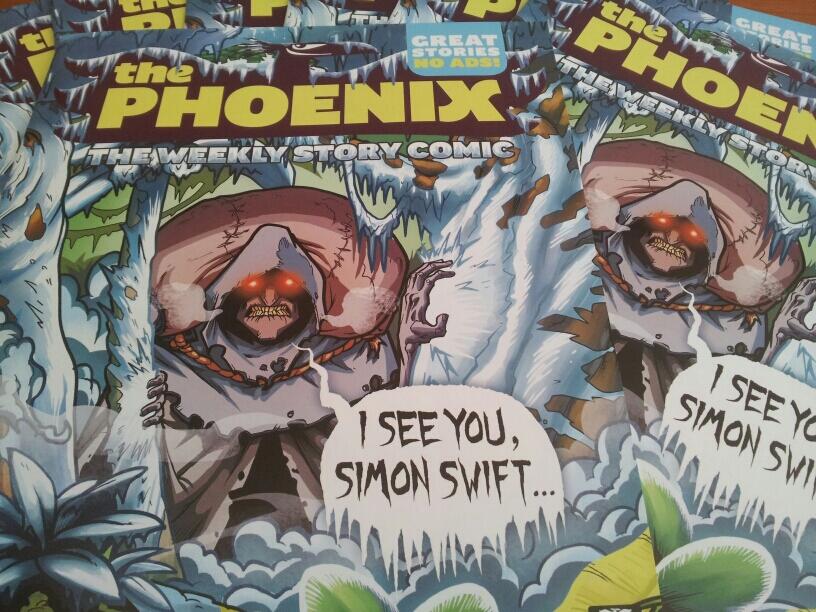
When I was working on the colours, my girlfriend Nikki suggested that it would be nice if the Phoenix logo was frosted up by The Fetch too, I passed that idea onto Will who loved it! The Phoenix's amazing designer (and comic artist extraordinaire) Paul Duffield executed it absolutely beautifully and added in The Fetch's speech balloon, elevating it to a whole new level! Here's the finished article (nicked from The Phoenix's Twitter feed)! I'm really pleased with the finished result and can't wait to see it on the shelves this Friday!
Awesome work Zak, your choice of colour is great too!
ReplyDelete